

In fashion, colour is one of the strongest levers you have. Knowing the basics of colour pairing is therefore an essential step for anyone who wants to dress with taste.
Shades, complementary colours and, above all, contrast are central to style, yet they are not things you can simply improvise. To help you sidestep the most common mistakes, here is a complete guide to matching colours, and fabrics too.
How do you match colours well?
To get colour pairing right, start by getting to grips with a few fundamental principles: shade ranges, complementary colours and contrast.
What is a colour shade range?
The shade range plays a key role. It is the spread of tones a given colour can take, from the lightest to the darkest. Understanding shades lets you build balanced combinations and explore different intensities.
What are complementary colours?
Complementarity is another crucial idea. It means using colours that sit opposite each other on the colour wheel to create a harmonious contrast. Blue and orange, for instance, are complementary: paired with care, each makes the other look better. The technique adds visual depth and draws the eye to the details of your outfit.
Here is a table showing how the main colours complement one another.
| Main colour | Complementary shade |
|---|---|
| Red | Green |
| Blue | Orange |
| Yellow | Purple |
| Green | Red |
| Orange | Blue |
| Purple | Yellow |
| Pink | Green |
What is contrast?
Contrast, for its part, uses clearly distinct colours to create more striking combinations. Pairing bright shades with softer neutrals, for example, tends to produce a bold visual effect that lifts the whole outfit.
Here are a few colours that work beautifully together thanks to their contrast:
| Main colour | Accent colour |
|---|---|
| Black | Yellow |
| White | Navy blue |
| Red | Turquoise |
| Pink | Emerald green |
| Orange | Petrol blue |
| Purple | Mustard yellow |
| Green | Ruby red |
These combinations strike an interesting visual balance by pairing colours that set each other off. Bear in mind, though, that the contrast effect varies with the saturation and intensity of the colours you use. Feel free to adapt these pairings to your own taste and to the style you want to create.
Which mistakes should you avoid when matching colours?
When you venture into colour pairing, it helps to know which mistakes to avoid if you want to keep the outfit harmonious.
A common one: falling into the tone-on-tone trap.
A monochrome outfit can look elegant, but it needs touches of contrast to avoid looking flat. Add pieces in slightly different shades, or accessories that create a subtle contrast.
Another trap is pairing colours that clash.
Some combinations can feel harsh on the eye and suggest a lack of coordination. Avoid mixing colours that are too close to each other and favour more harmonious pairings.
Here is a table of colour combinations that tend not to sit well together:
| Main colour | Colour to avoid |
|---|---|
| Red | Pink |
| Yellow | Orange |
| Green | Purple |
| Blue | Turquoise |
| Brown | Grey |
These pairings can feel discordant because the colours share similar tones. The result? Too little visual contrast, which rarely looks good.
How do you create contrast between your clothes and your accessories?
For a marked contrast, play with fabrics as well as colours. Combining different textures adds an interesting visual dimension. You might, for example, pair a fluid silk top with leather trousers for a striking contrast of materials.
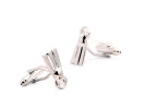
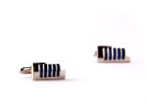
Accessories can play a key role here too. Choose a belt, cufflinks or a watch in bright colours or bold patterns to bring some energy to your outfit.
Remember that matching colours and fabrics also depends on the kind of outfit you want to wear. Informal, relaxed occasions call for more contrasting combinations, while a more classic style can favour quieter, darker tones paired with traditional fabrics.
Once you master the art of matching colours and fabrics, you can build outfits that reflect your individuality and draw admiring glances. Experiment, be creative and wear your personal style with confidence.
In summary
Matching colours and fabrics is a genuine art that takes practice and an understanding of a few fundamentals. To recap what we have covered:
- Avoid the common mistakes (tone on tone, clashing colours)
- Play with shades, complementary colours and contrast
- Bring fabrics together through your accessories
- Adapt your outfit to the overall effect you are after (relaxed or smarter)
Don't be afraid to try bold colour combinations and unexpected pairings of fabrics that reflect your personality. With a little creativity and confidence, you can master the art of matching colours and fabrics, and make every outfit a statement of who you are.